The Psychology of Colors in Nigerian Branding
When you think of Nigerian brands, certain colors immediately come to mind: green for Glo, red for Airtel, blue for First Bank. None of these choices were random. Colors don’t just decorate a logo — they shape how customers feel, trust, and decide.
In Lagos, Aba, or Kano markets, a single color can mean the difference between someone picking your product or ignoring it. That’s the quiet power of color psychology in Nigerian branding.
Why Colors Matter in Nigeria
1. Cultural meaning: In Nigeria, green often signals freshness or growth, while gold suggests prestige. A school painted bright blue feels calm and trustworthy, while one in dull grey looks uninspiring.
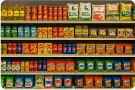
2. Emotional triggers: Red excites. Blue reassures. Yellow draws attention. These emotions matter when people are choosing between 20 brands on a supermarket shelf.
3. Competitive edge: Most small businesses don’t think about color at all. That’s an opportunity. By picking a strong, consistent color identity, your business can stand out quickly.
Examples of Color Psychology in Action
- Banks: Zenith’s red feels bold and energetic. GTBank’s orange is vibrant and modern. First Bank’s blue communicates trust and tradition.
- Food brands: Indomie’s yellow and red packaging makes it impossible to miss on shelves. LaCasera’s green bottle suggests freshness.
- Politics: Parties in Nigeria lean heavily on color identity — from PDP’s green-white-red umbrella to APC’s blue-green-brown broom.
How to Choose the Right Colors for Your Business
1. Know your audience. Are you targeting parents, youth, or professionals? Bright fun colors work for schools, but sober blues fit banks.
2. Match emotion to product. Selling luxury fashion? Think black and gold. Running a tech startup? Blue and white suggest innovation and trust.
3. Keep it consistent. Don’t use blue on your website, red on your packaging, and green on your flyers. Stick to a simple palette so people remember you.
4. Test before finalizing. Print samples of your packaging in two color options and see which one customers gravitate toward.
Quick Color Guide for Nigerian Businesses
- Green: Growth, freshness, wealth (great for agriculture, food, eco-brands).
- Blue: Trust, calm, professionalism (ideal for schools, banks, tech firms).
- Red: Energy, urgency, passion (perfect for food stalls, entertainment, campaigns).
- Yellow: Optimism, attention, warmth (good for children’s products, FMCGs).
- Black/Gold: Prestige, luxury, power (best for fashion, premium services).
The Missed Opportunity
Too many Nigerian SMEs just “pick a paint color” without strategy. That’s like leaving money on the table. When color is chosen intentionally, it becomes a shortcut in the customer’s mind: “Red pack? That’s Indomie. Green logo? That’s Glo.”
Final Thoughts
Color is not decoration. It is psychology, culture, and business strategy rolled into one. In a crowded Nigerian market, color can make your brand unforgettable.
Want to choose the right colors that make customers trust and buy from you? LabelReach can guide your branding today